Thomas Ekelund is a wonderful person. Not only does he create heartwrenching dronepop under his Dead Letters Spell Out Dead Words-moniker, he also creates some of the most stunning artwork out there today.
Having maintained his Fukk God Let's Create label between 1999 and 2005, he has since a couple of months back now moved on to other things, including Fukk Tapes Let's Erase (probably the most obstinate, anal cassette-label in the world), doing more and more artwork/webdesign for various artists/labels like iDEAL, Kid606, Andrey Kiritchenko etc, and continuing to grace us with the ever evolving beauty of DLSODW.
I asked thomas which his favourite recordcovers were and here´s his pick, in no particular order:
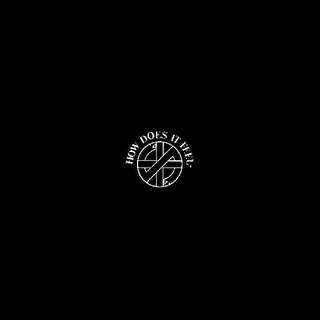
Crass - How Does It Feel 7"
It could really be any Crass cover at all. G. Sus used simple means to
great effect. Almost always in monochrome, bold typography and creative
use of found imagery. What sets How Does It Feel apart is it's almost
classisist layout. A simple black cardstock cover with the Crass logo and
title on the front and a printed innersleev containing only text. Simple
and bold.
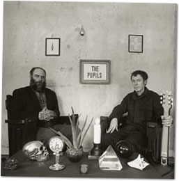
The Pupils - S/T LP
There's really no design to talk about on this cover. Just a photo. But
what a photo. Even though it's a straight forward portrait it's littered
with symbolism and it vibrates of mysticism. The perfect companion to the
album.

Discharge - Never Again 7"
Simplistic beyond words, the Discharge signature cover design is in a way
closely related to Crass but a lot crueder. The image of the impaled peace
dove has been lifted from a 1930's anti-war poster.

Throbbing Gristle - 20 Jazz Funk Greats
All Throbbing Gristle covers have their own unique charm. Similarily most
of them grow if you know the background and concept of the cover. 20 Jazz
Funk Greats looks like a nice, safe album. The band in velore possed on a
moor overlooking the ocean. That's all fine and dandy, but when you learn
that the moor is the imfamous Beachy Head, England's number one suicide
spot the image takes on a whole other meaning. It's all about what
information and lack of information changes you perception.

Godspeed You Black Emperor - F# A# ∞ LP
It might be a cop out to list this album, but the fact is that it is a
very nicely packaged LP. From the textured, debossed cardboard, to the
glued on photo and the myriad of different inserts, it alll ties in with
the music and the theme's of the album.
I also asked him the following:
Which was the first cover you did for someone else?
The first off set printed record cover I did was...
hmm, I am not quite sure actually. Probably the Kid 606/Dwayne Sodahberg
7" cover or the A. Kir digipack. Of course I'd done alot of hand made
covers befor that.

Tell us about some design-style that has been influential on you tho you might
not really would like it to:
Anything in the back page ads of OKEJ magazine in the
early eighties, which would mean classic hardrock designs. Lots of eagles,
goats, pointy type and iron fists.
And finally, what of your work are you most proud and/or pleased with?
That changes all the time. I am really proud of most of the work
I've done. Right now my favourites are the two Skull Defekts covers and
the forthcoming Rylander/Elggren cover. Or maybe my forth coming Dead
Letters album.
Thank you Thomas!
Be sure to check out thomas work (both musical and visual):
http://www.deadwords.org/
http://www.nullvoid.net/
Having maintained his Fukk God Let's Create label between 1999 and 2005, he has since a couple of months back now moved on to other things, including Fukk Tapes Let's Erase (probably the most obstinate, anal cassette-label in the world), doing more and more artwork/webdesign for various artists/labels like iDEAL, Kid606, Andrey Kiritchenko etc, and continuing to grace us with the ever evolving beauty of DLSODW.
I asked thomas which his favourite recordcovers were and here´s his pick, in no particular order:

Crass - How Does It Feel 7"
It could really be any Crass cover at all. G. Sus used simple means to
great effect. Almost always in monochrome, bold typography and creative
use of found imagery. What sets How Does It Feel apart is it's almost
classisist layout. A simple black cardstock cover with the Crass logo and
title on the front and a printed innersleev containing only text. Simple
and bold.

The Pupils - S/T LP
There's really no design to talk about on this cover. Just a photo. But
what a photo. Even though it's a straight forward portrait it's littered
with symbolism and it vibrates of mysticism. The perfect companion to the
album.

Discharge - Never Again 7"
Simplistic beyond words, the Discharge signature cover design is in a way
closely related to Crass but a lot crueder. The image of the impaled peace
dove has been lifted from a 1930's anti-war poster.
Throbbing Gristle - 20 Jazz Funk Greats
All Throbbing Gristle covers have their own unique charm. Similarily most
of them grow if you know the background and concept of the cover. 20 Jazz
Funk Greats looks like a nice, safe album. The band in velore possed on a
moor overlooking the ocean. That's all fine and dandy, but when you learn
that the moor is the imfamous Beachy Head, England's number one suicide
spot the image takes on a whole other meaning. It's all about what
information and lack of information changes you perception.
Godspeed You Black Emperor - F# A# ∞ LP
It might be a cop out to list this album, but the fact is that it is a
very nicely packaged LP. From the textured, debossed cardboard, to the
glued on photo and the myriad of different inserts, it alll ties in with
the music and the theme's of the album.
I also asked him the following:
Which was the first cover you did for someone else?
The first off set printed record cover I did was...
hmm, I am not quite sure actually. Probably the Kid 606/Dwayne Sodahberg
7" cover or the A. Kir digipack. Of course I'd done alot of hand made
covers befor that.
Tell us about some design-style that has been influential on you tho you might
not really would like it to:
Anything in the back page ads of OKEJ magazine in the
early eighties, which would mean classic hardrock designs. Lots of eagles,
goats, pointy type and iron fists.
And finally, what of your work are you most proud and/or pleased with?
That changes all the time. I am really proud of most of the work
I've done. Right now my favourites are the two Skull Defekts covers and
the forthcoming Rylander/Elggren cover. Or maybe my forth coming Dead
Letters album.

Thank you Thomas!
Be sure to check out thomas work (both musical and visual):
http://www.deadwords.org/
http://www.nullvoid.net/
posted by johan at 11:38 PM
![]()

3 Comments:
Hmm, vilket av Kiritchenkos släpp har Thomas distillerat fram? Vågar man hoppas på det underbara True Delusion?? Ett av fjolårets finaste album i mitt tycke!
the b&w tg cover is quite charming as well.
http://brainwashed.com/common/images/covers/fet2005.jpg
split link?
...images/covers/fet2005.jpg
Post a Comment
<< Home